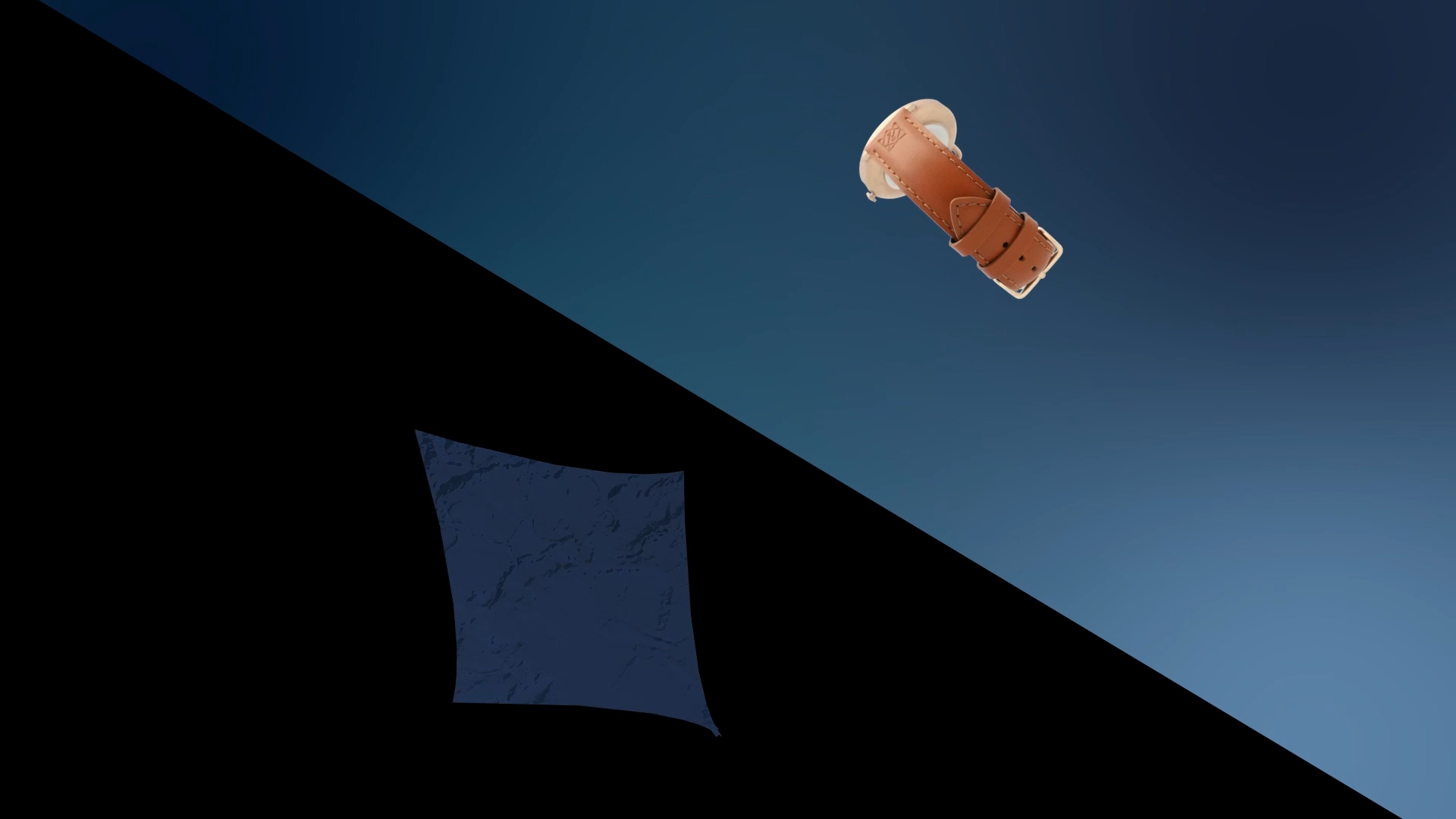
The bespoke leather-ware company, Freedom of Movement approached the Academy to assist in creating a social media campaign to improve their social media account reception. The brief was handed down to the Photography department to handle all things concerning the shooting of their wares and packaging, the result of which would be handed down to the multi-media department to process and turn into some unique final products.
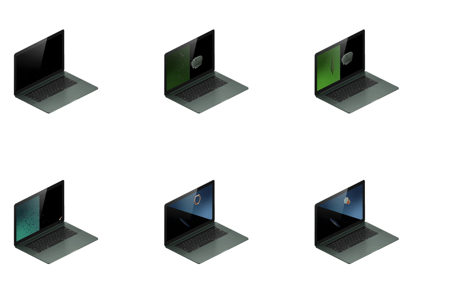
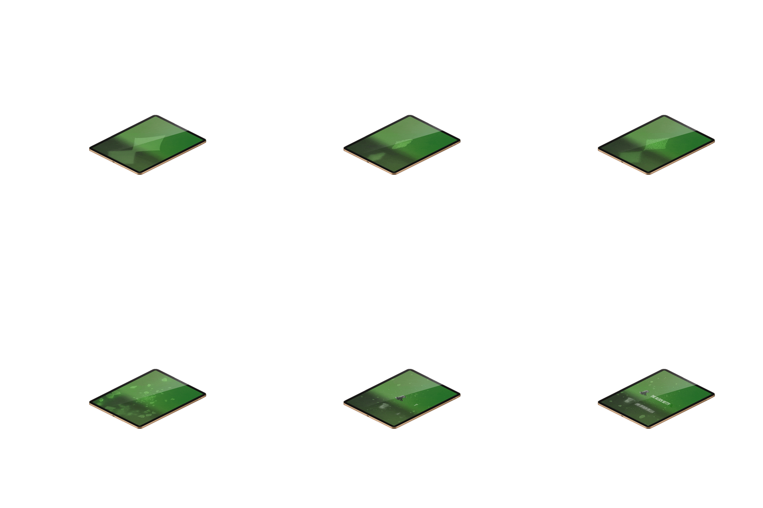
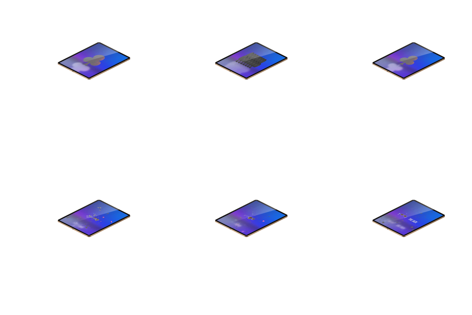
Brand Enhancement, Product Shots, Motion-Graphics, 3D modelling, After Effects, C4D, Element 3D.
The problem was two-fold. Firstly, the brand identity had to be explored, broken down, and each of its component parts were needed to be understood. Secondly, utilising what elements were given to us, the multi-media team had to establish a motion-graphic campaign that could revitalise traffic into their various social media platforms, whilst staying as true as possible to the brand identity as possible.
The multi-media team was tasked to create individual unified mograph-orientated campaigns by way of the photographic material provided by the photography department for each of their social media platforms on their product offering. The approach taken towards handling this brief was to coincide their primary offerings to a suite, each with their own distinctive color palatte and symbol. This gave sufficient room for distinctive enought motion-graphics but similar enough to tell that they are a part of the same campaign.
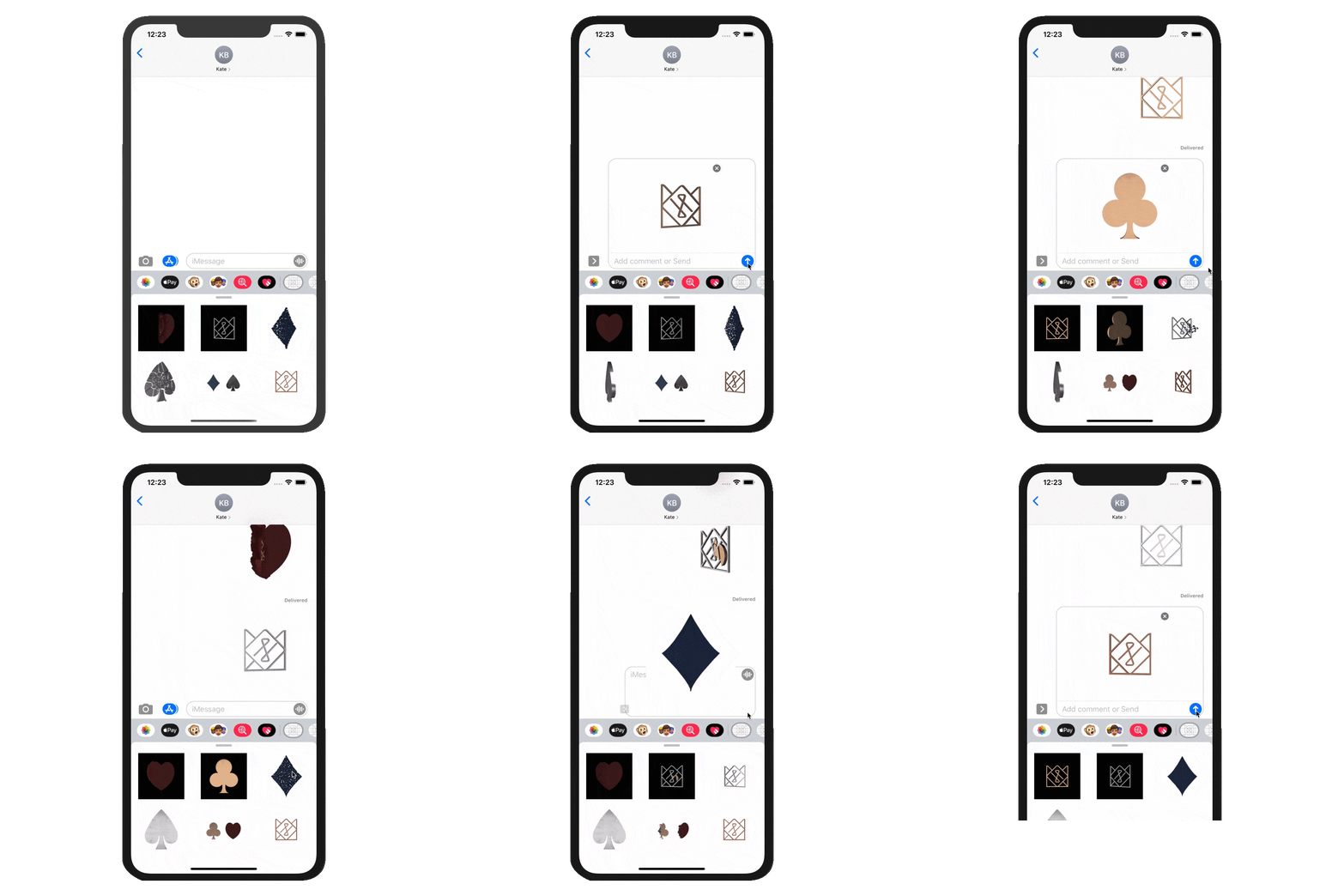
Among all the deliveriables necessary to meet the brief requirements, there was one optional deliverable to improve the reception of the campaign. That was an iOS exclusive sticker-pack with the business's brand identity. The sticker-pack contained some of the campaign material tied to 3D models elements used in some of the motion grapics from the various social media-specific deliverables.
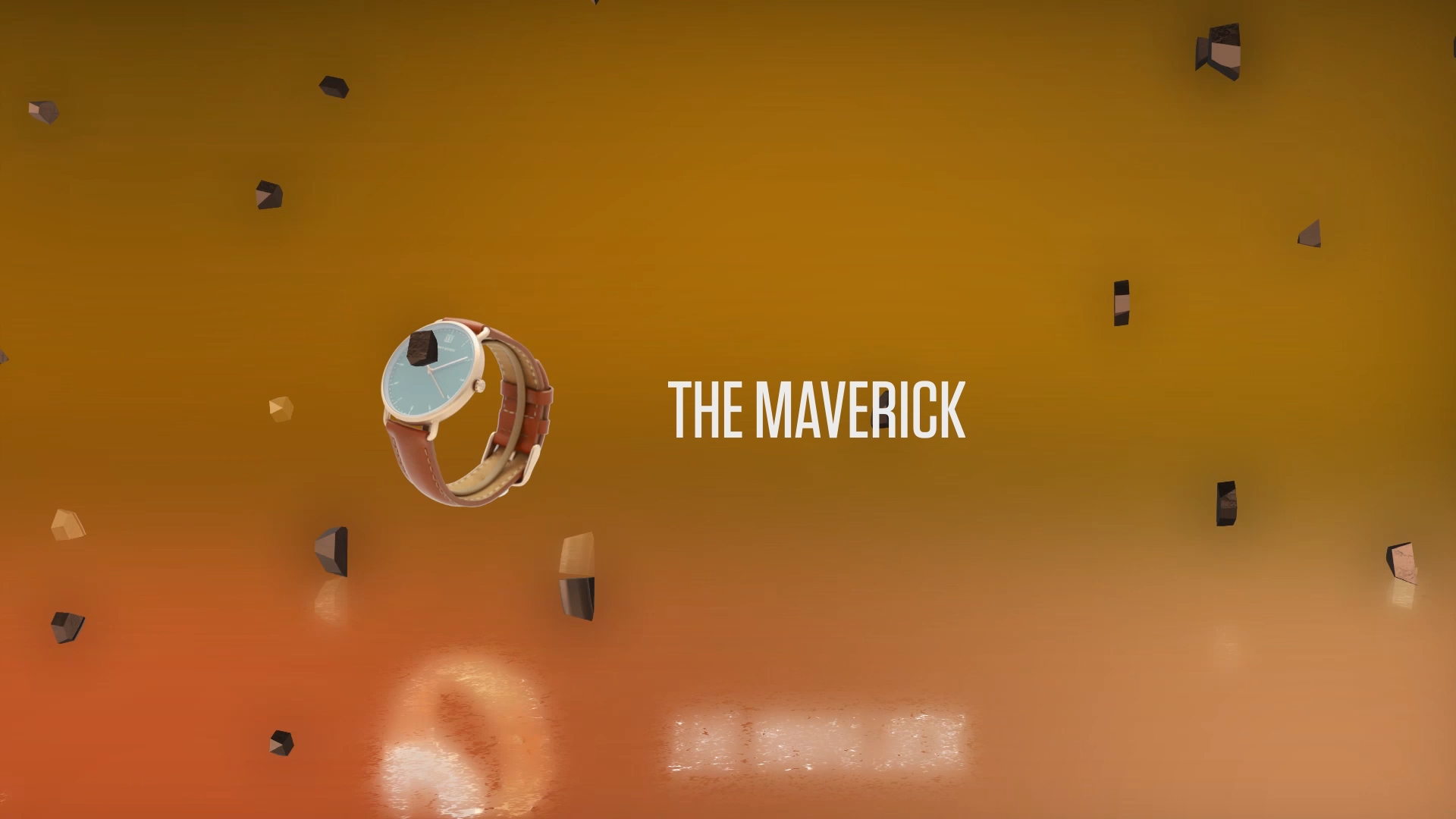
The deliveralbe for their Facebook platform was a horizontal video post (1920 X 1080px). With each of the 4 major deliverables, a suite and specific color scheme was paired with each of them. Facebook was paired with copper colors and the suite of hearts, which complemented the copper colors of the Maverick wrist-watch from the companies offering.
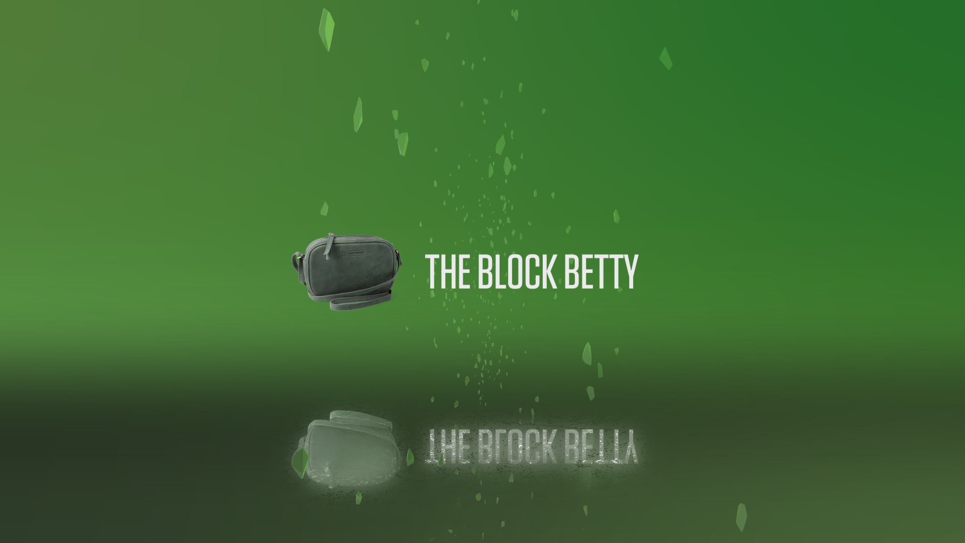
The deliveralbe for their Instagram account was a verticle video post (1350 X 1080px). The Block Betty was put on display, and given the shade of green the bag possessed, it was deemed fit to complement the color with additional shades of green, and because of the jade appearance of the gradient, it only seemed fitting to complement the color with an equally fitting representative shape, the diamond, hence the Jade Diamond Suite.
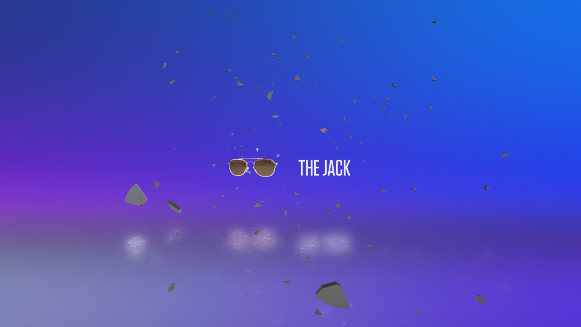
The deliveralbe for their Pinterest account was a promoted square video post (1000 X 1000px). The Jack was difficult item to chose colors for, so consideration was placed on its material qualities rather than its appearance. Because the Jack gets its ability to function from its metallic arms, it was deemed appropriate to chose colors found in metallic chromaticisation. A gradient of blues and pinks were selected, and the color of the suite would be silver, to represent the strong qualities the arms portray, and thus the Silver Clover Suite was made.
The deliveralbe for their Youtube account was a standard size video advert (1920 X 1080px). Unfortunately, due to the limited material of 3D-shot products, an executive decision was made to avoid breaking from the consistant thread of design decisions up till this point, and rather than serve an injustice to one of their products, chose to create a "full suite" of products along with their actual suites to promote a whole range of items in a short space of time.
